Let's pivot around your values to create strong design solutions together.
DIOGONOS is
a global
design agency
dedicated to developing your brand's full potential from the foundation up.
Our design process seamlessly incorporate your brand DNA, from conceptualizing products to successful launches.
Check out our work.
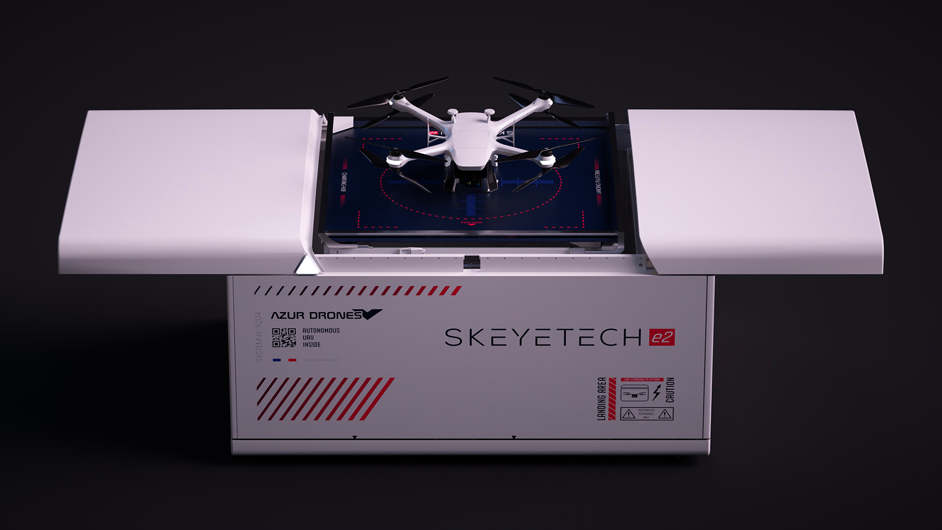
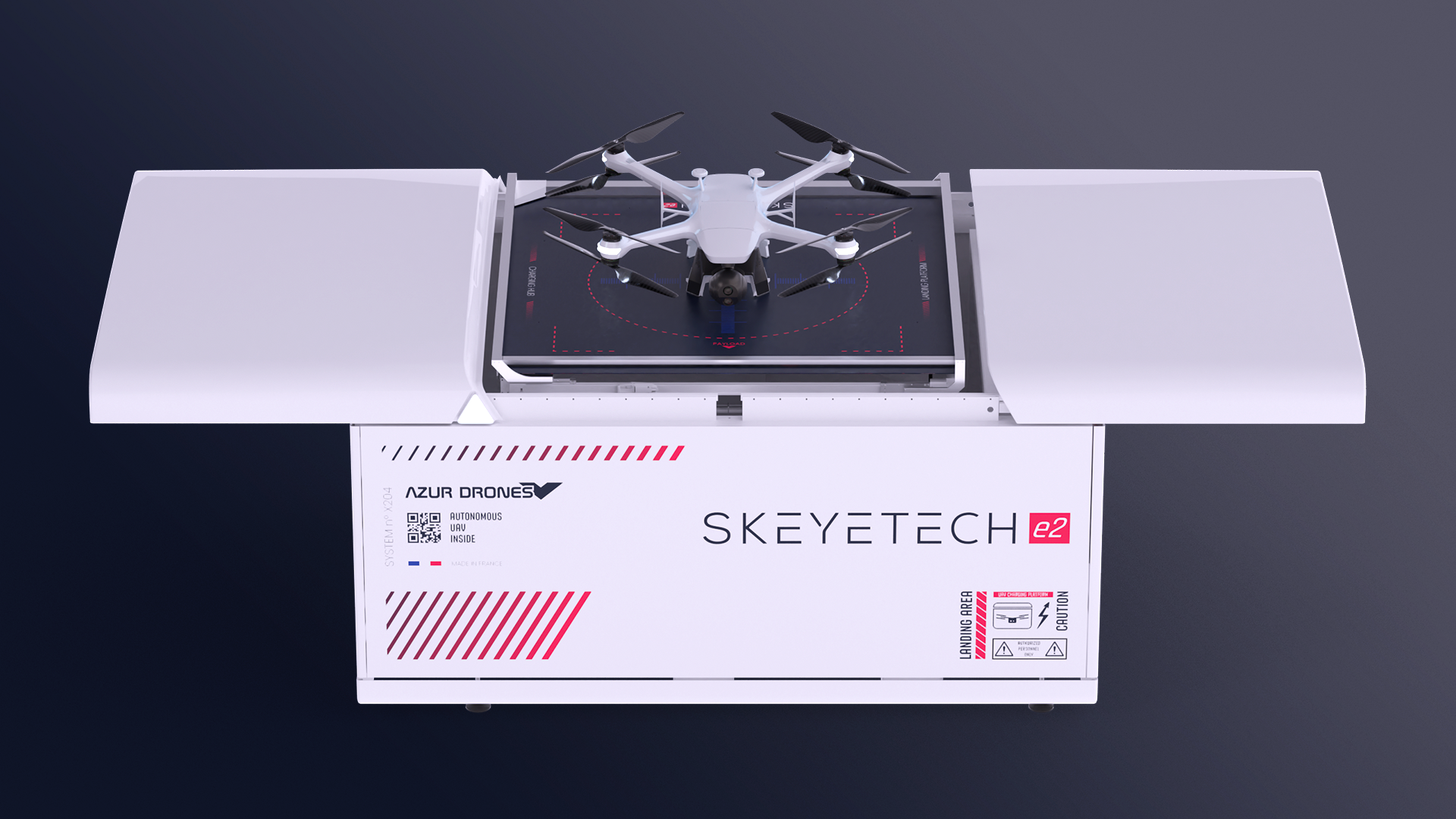
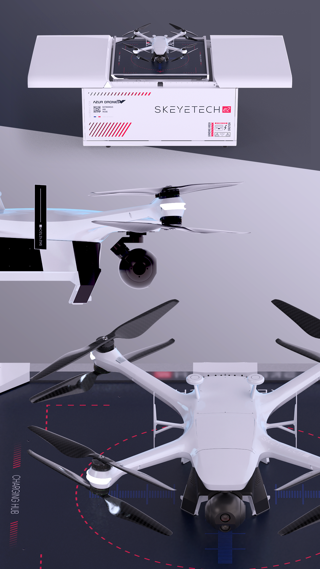
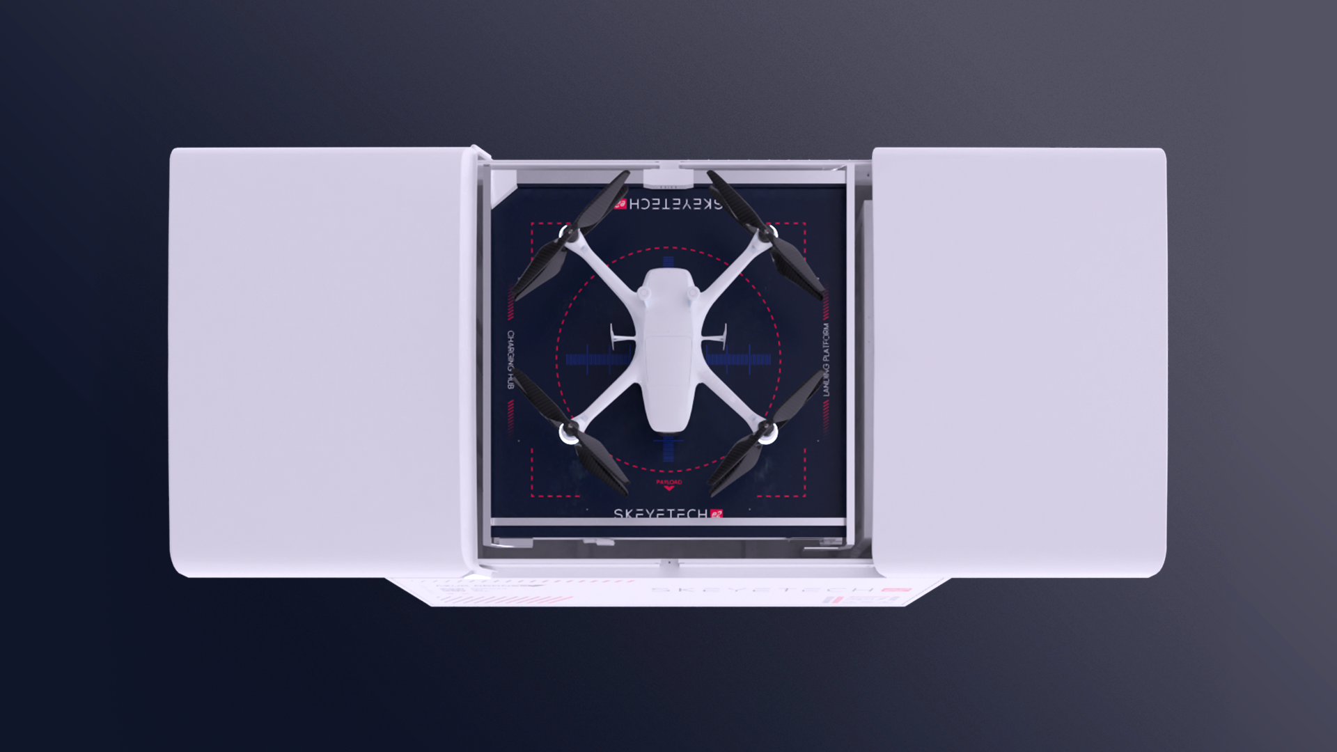
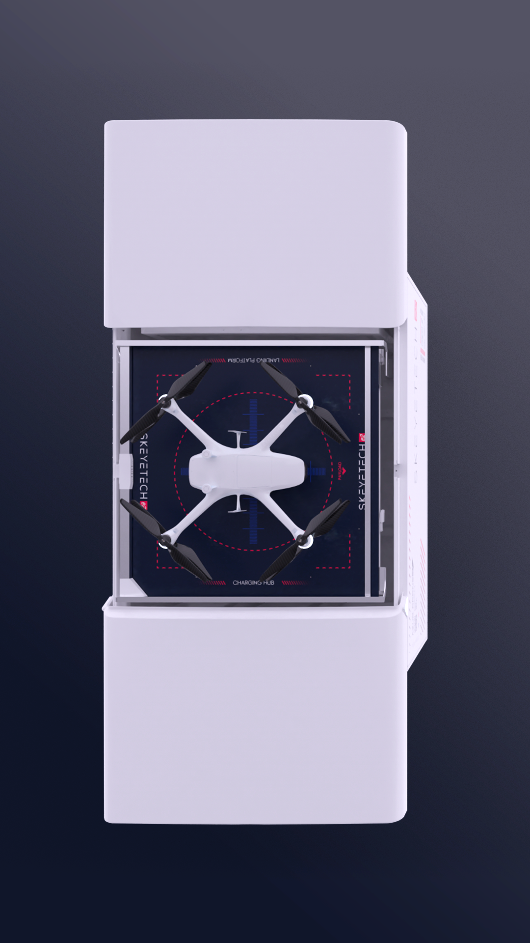
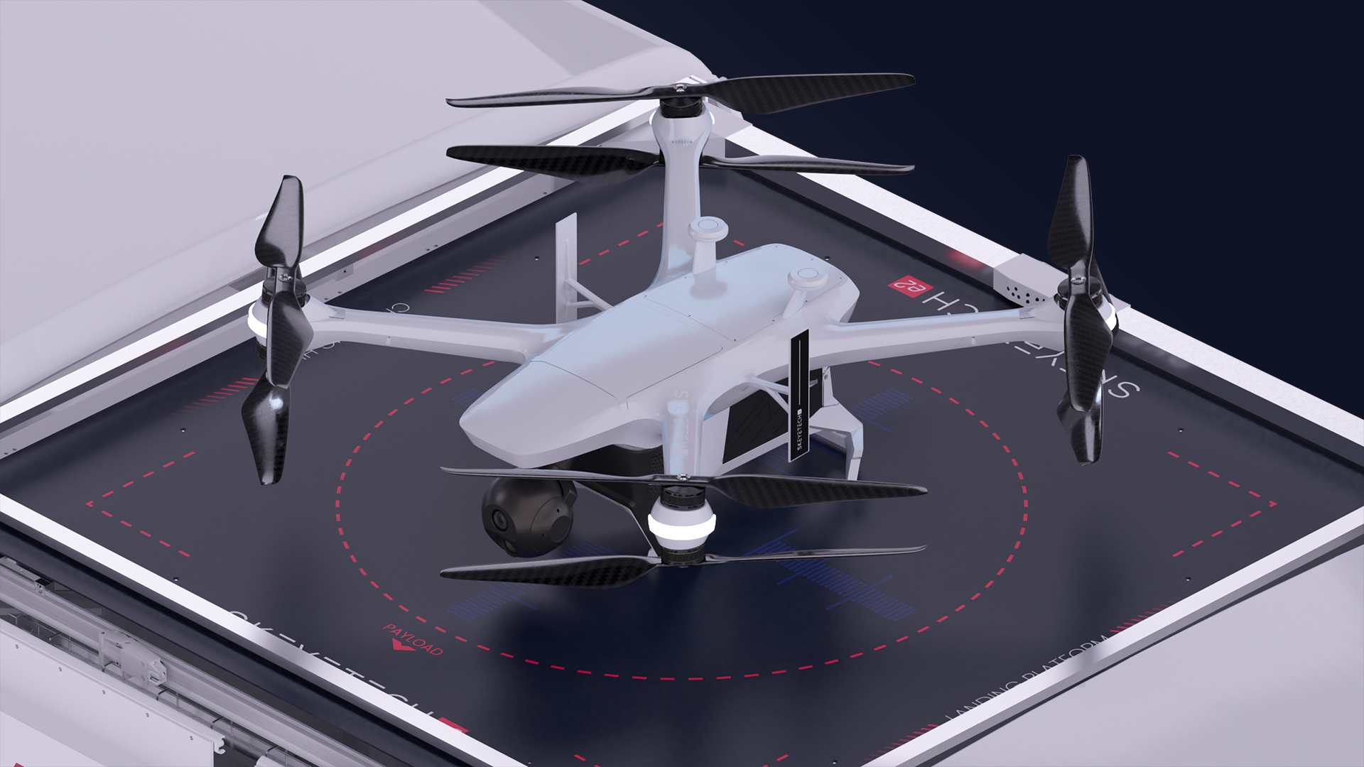
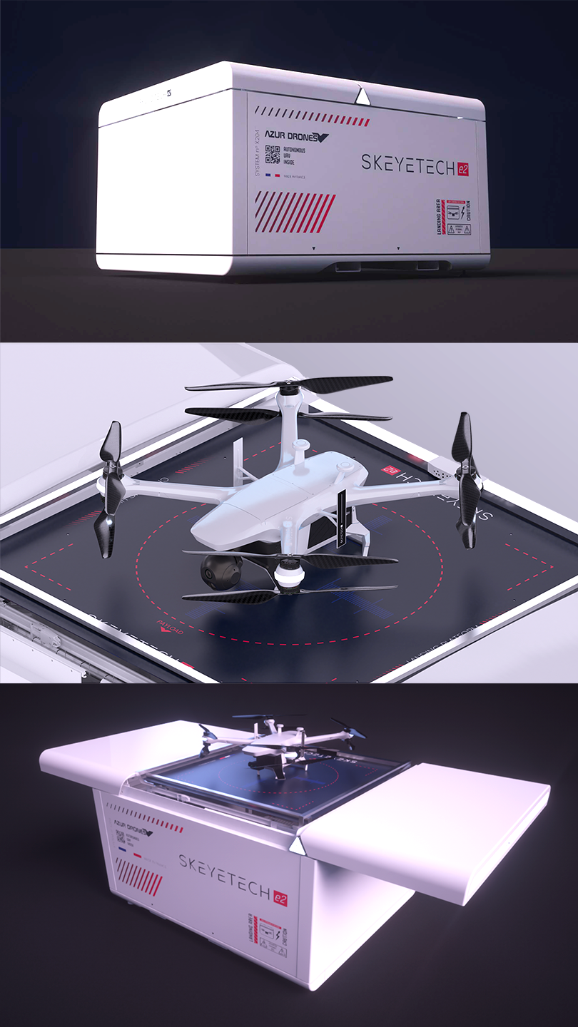
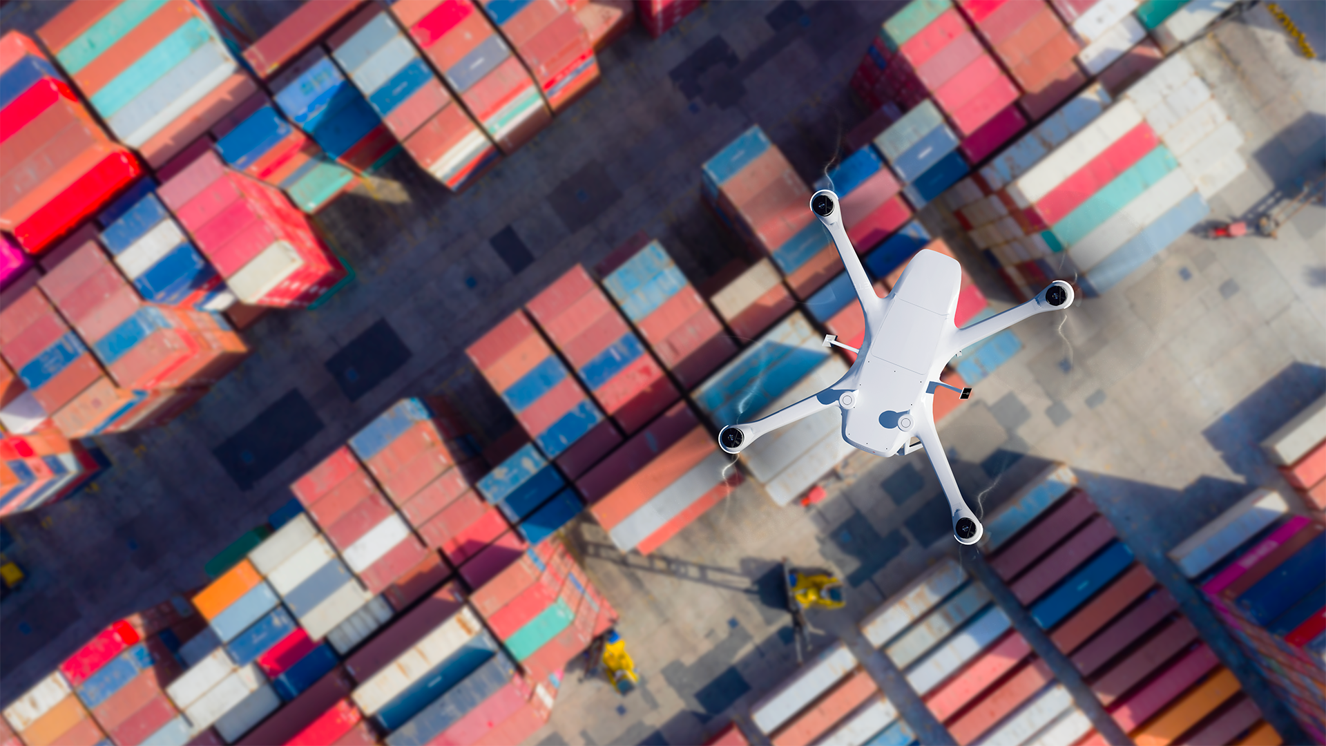
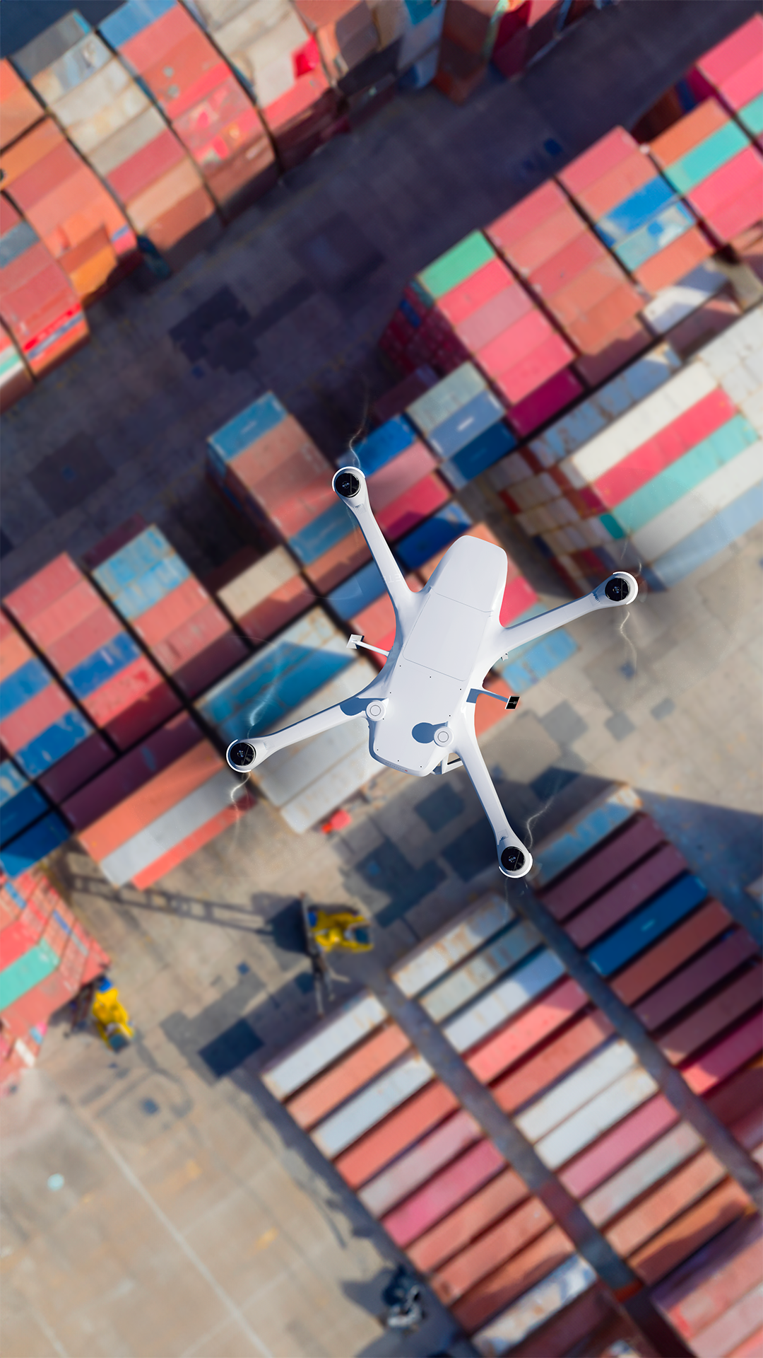
Skeyetech E2
From a proof of concept to an industrial product. That was the journey we had with AzurDrones. Their technology had the potential to upscale to a bigger market and they needed a resilient, versatile and scalable product to achieve their objectives. During two years, we worked with the teams (mechanical, electronic, software engineers and the operative and sales) to design the Skeyetech E2 solution. An autonomous drone in a box for safety and security applications on industrial sites. We developed a full integrated environment including the drone, the charging dock, the command interface and the press communication.
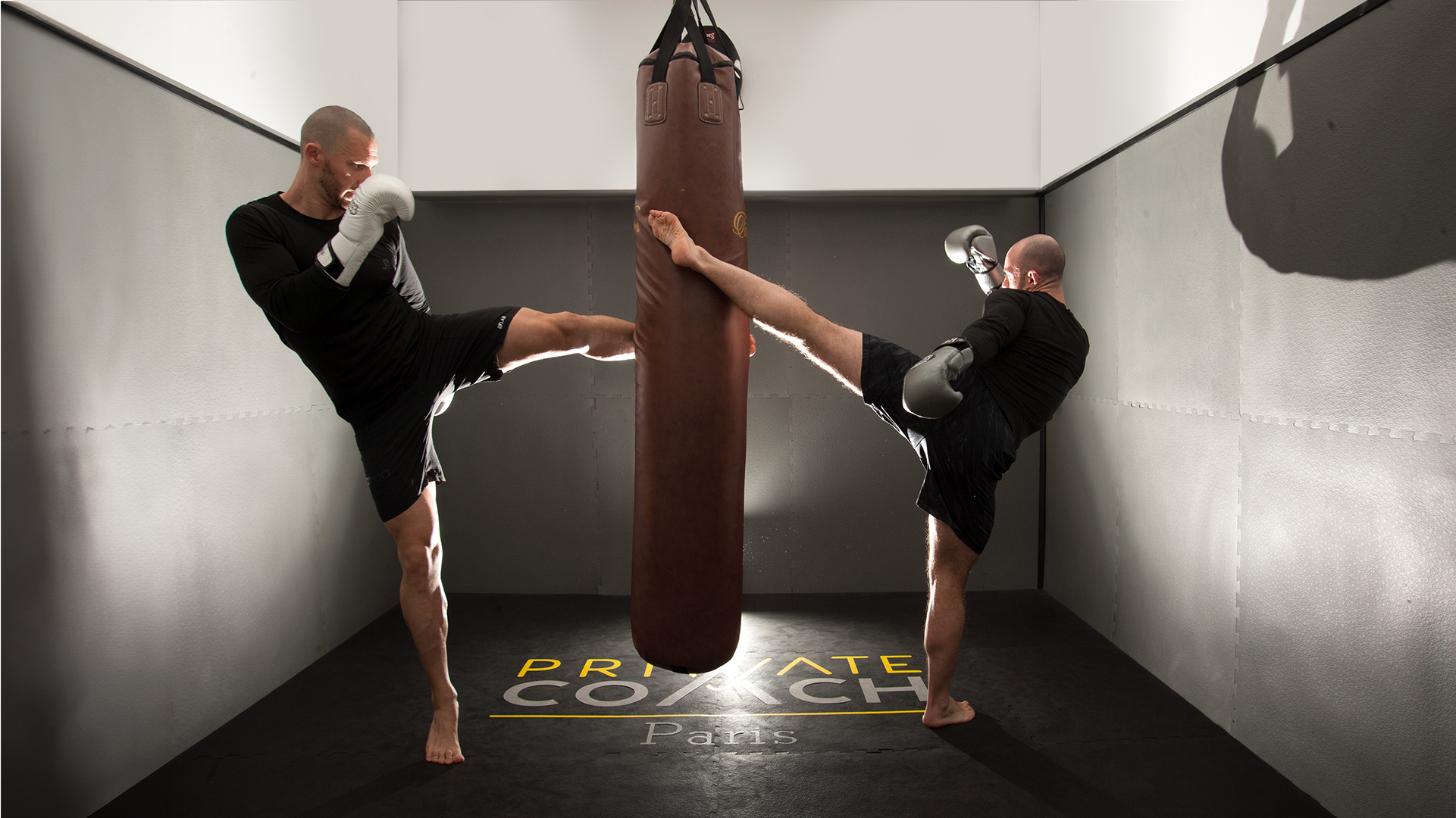
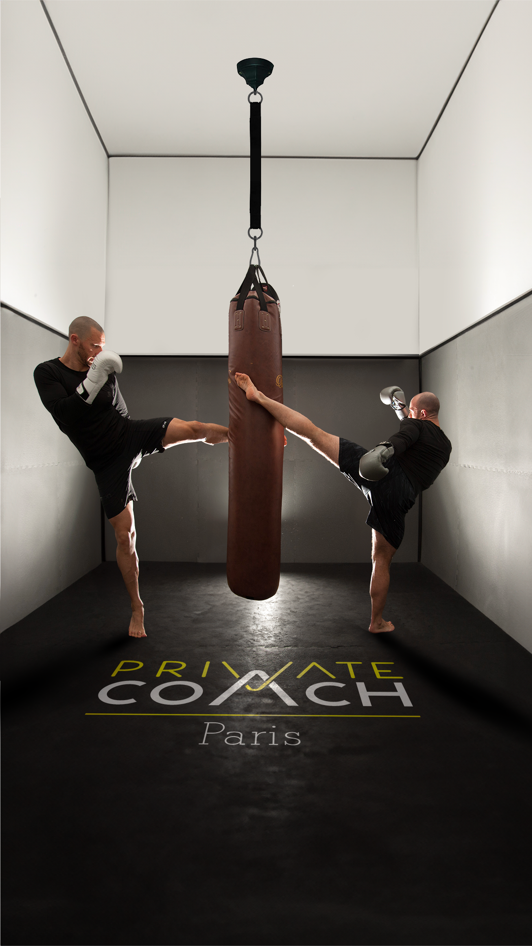
Private Coach
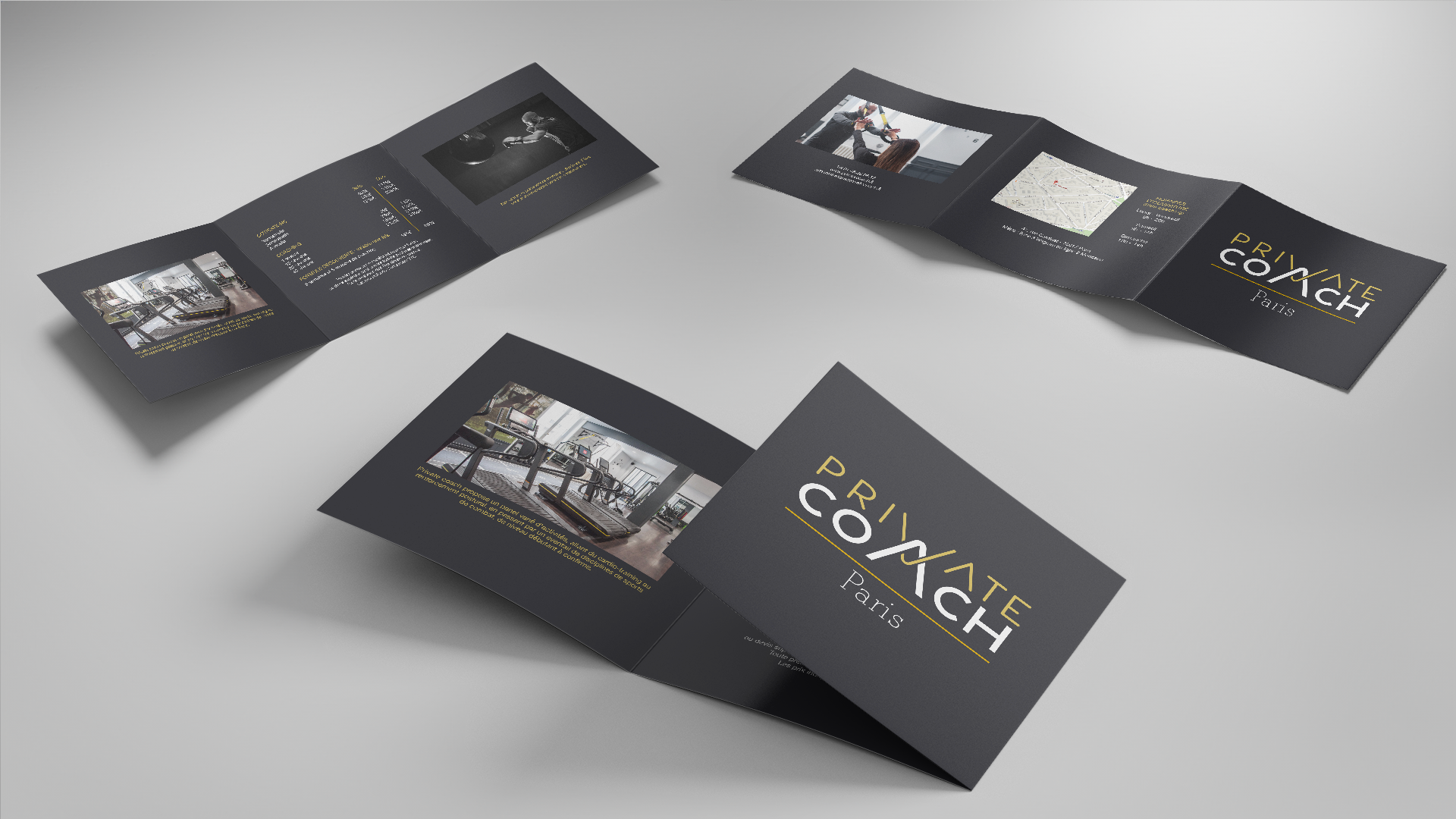
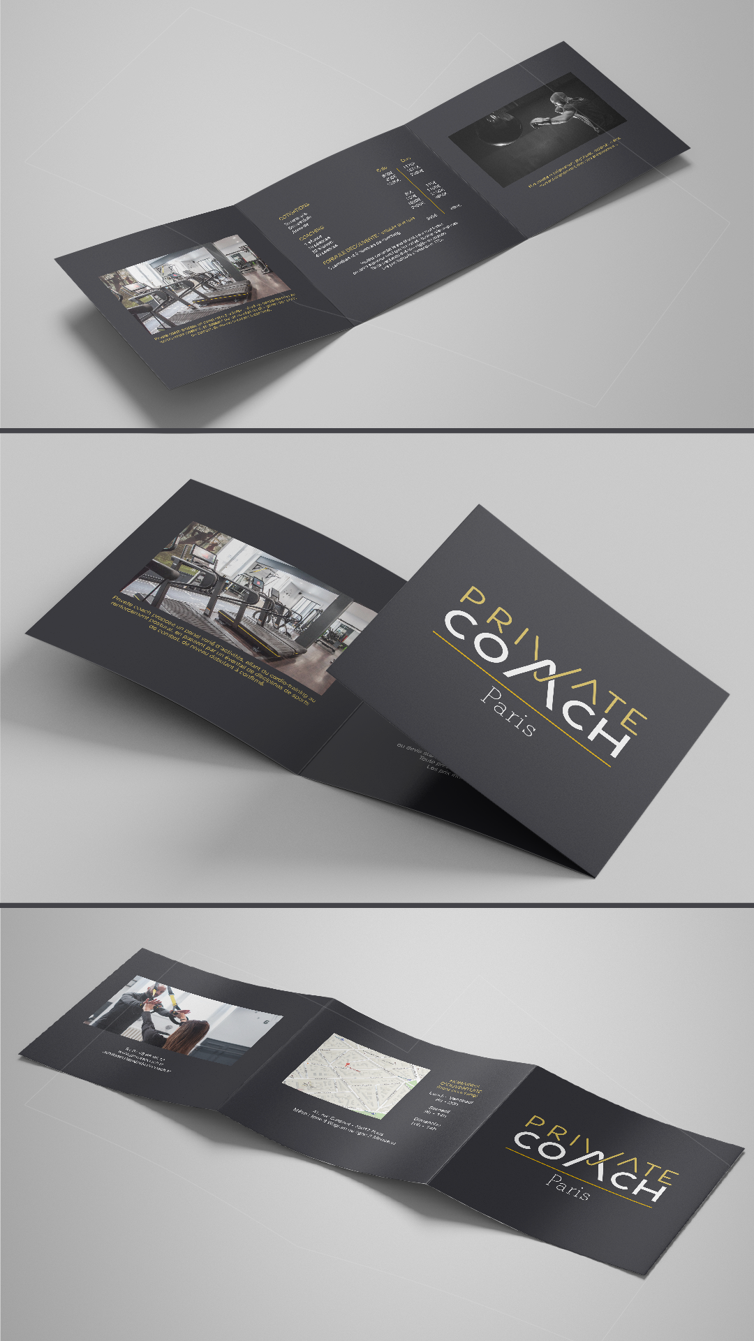
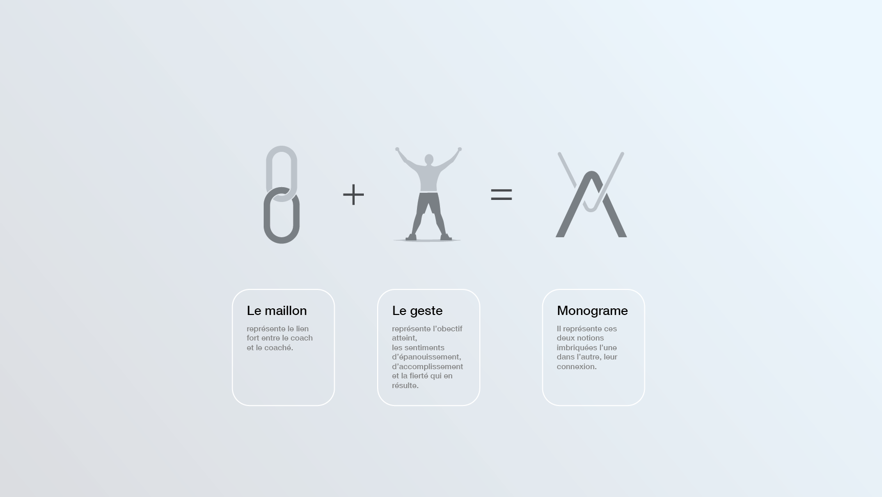
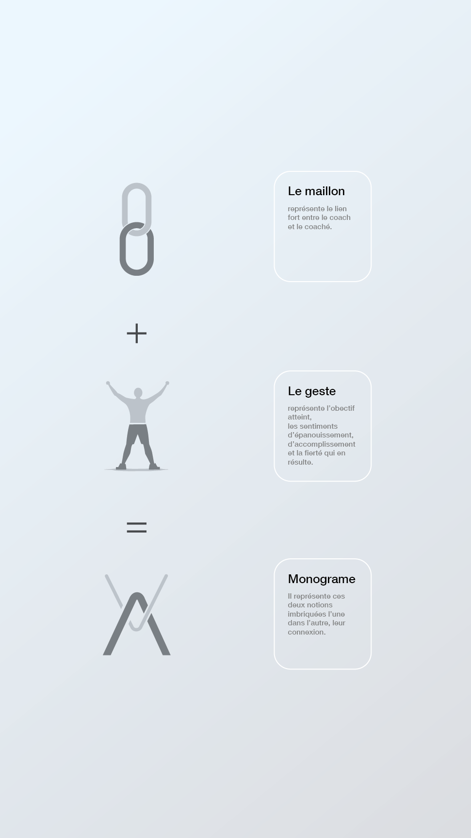
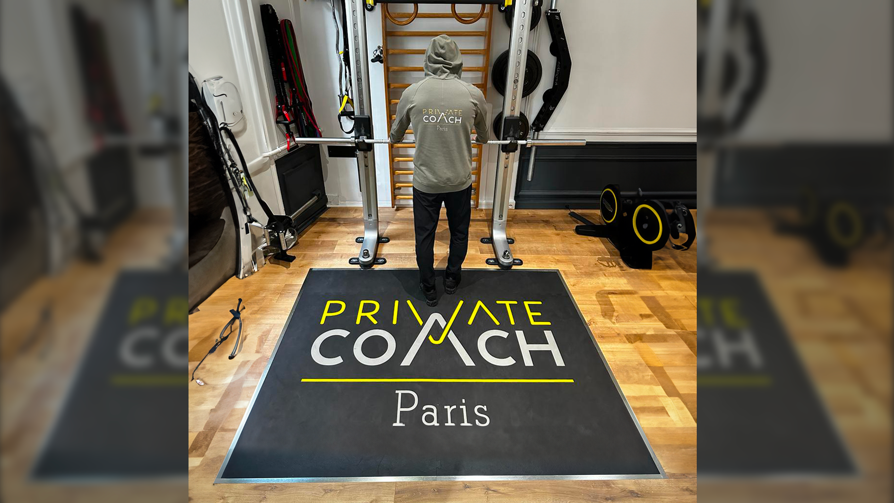
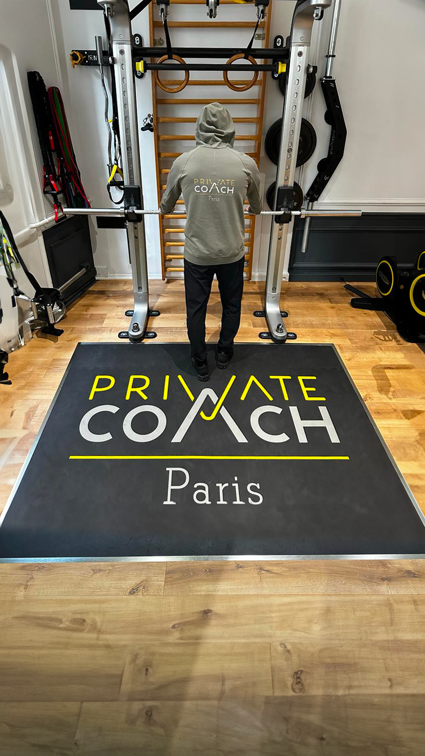
The logo is constructed around a symbol of triumph and achievement, where you can see raised arms in a gesture of victory and two chain links. This powerful imagery embodies the success and empowerment that clients can attain through Private Coach's coaching expertise. Surrounding the victorious gesture are two chain links, symbolizing unity, resilience, and unwavering strength. This element not only reinforces the idea of physical strength but also speaks to the strong bond between the coach and his client, that you can experiment through the coaching journey.
Ana des Cabanasses
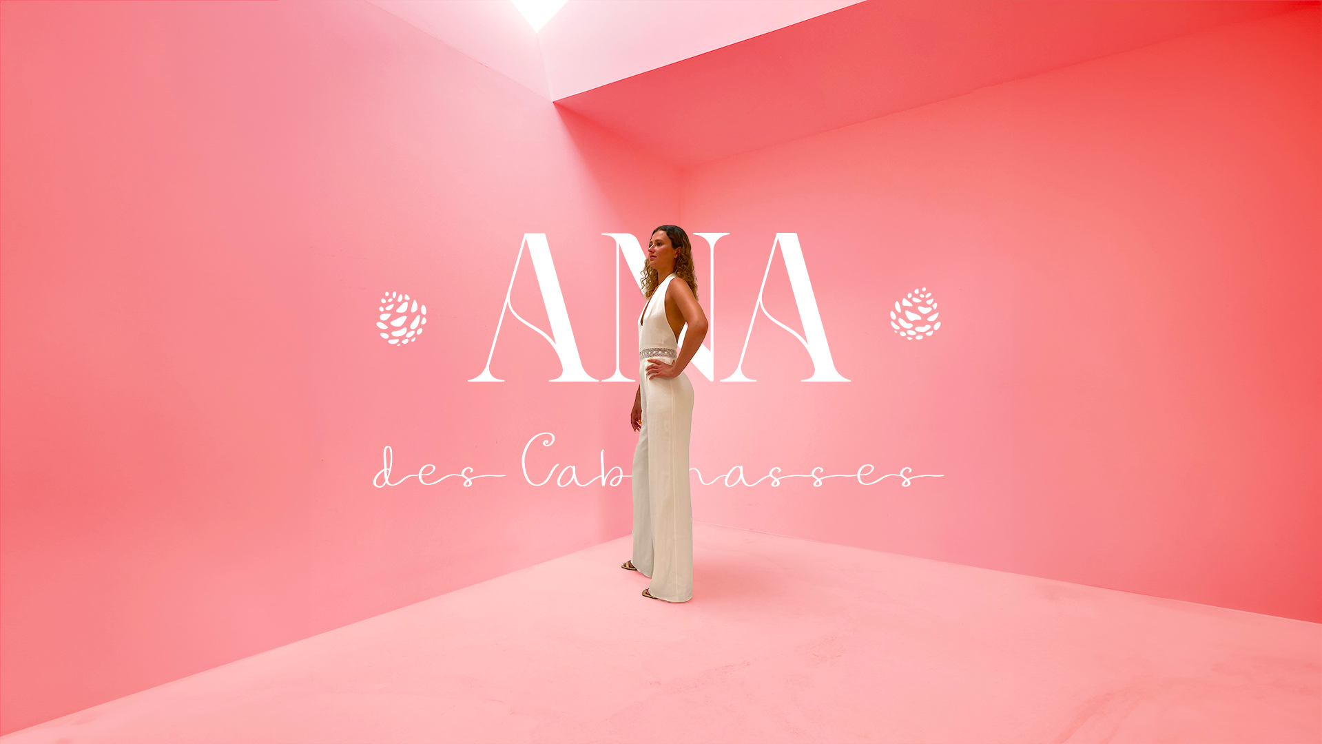
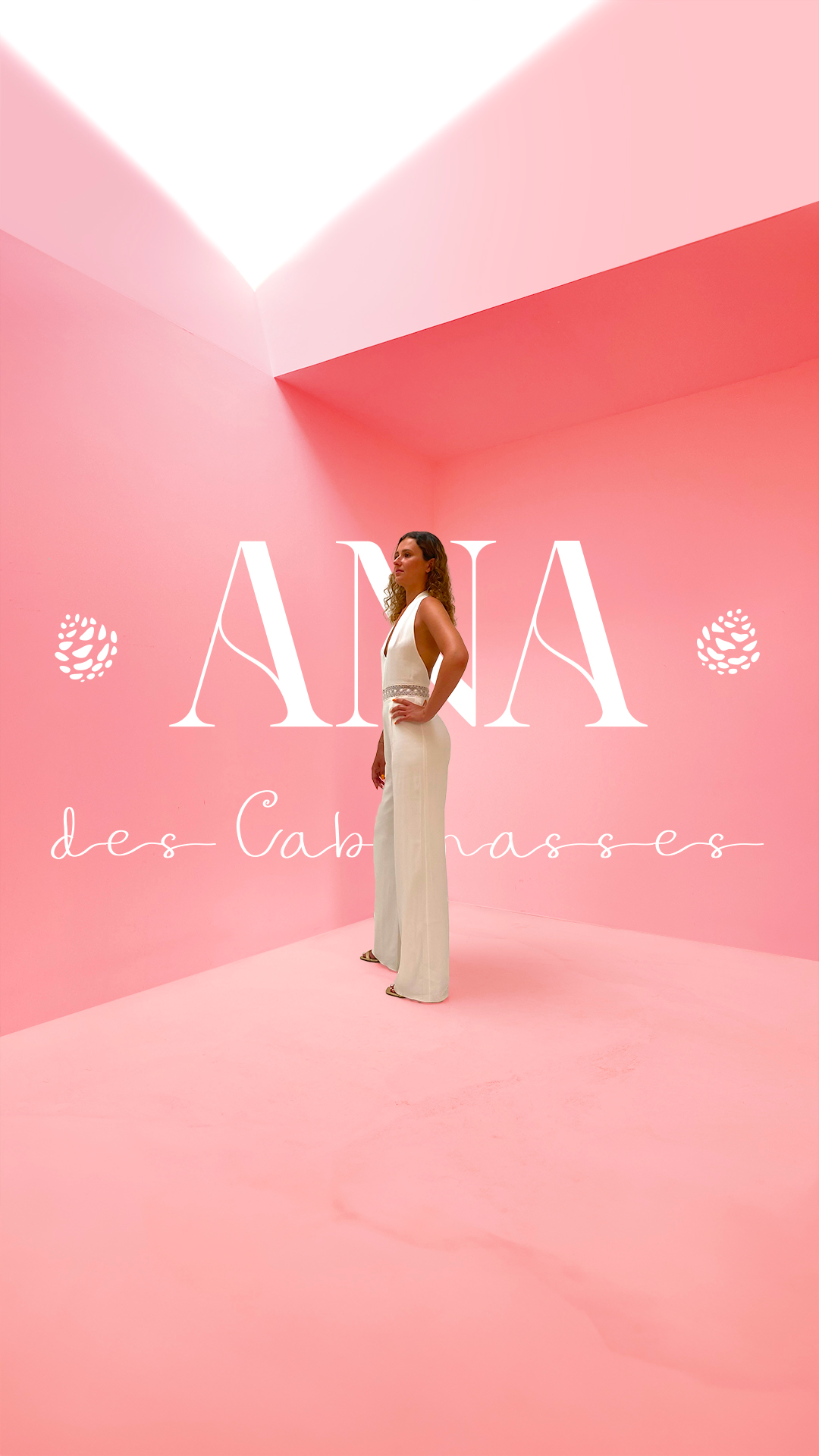
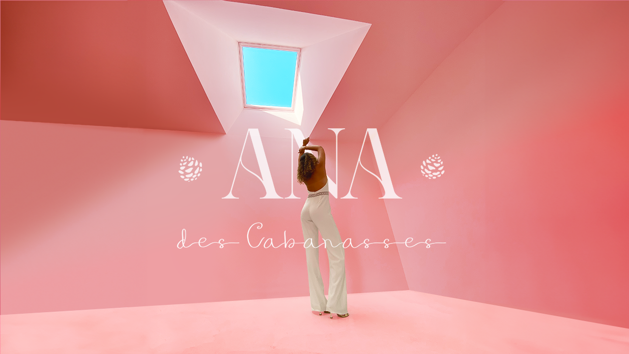
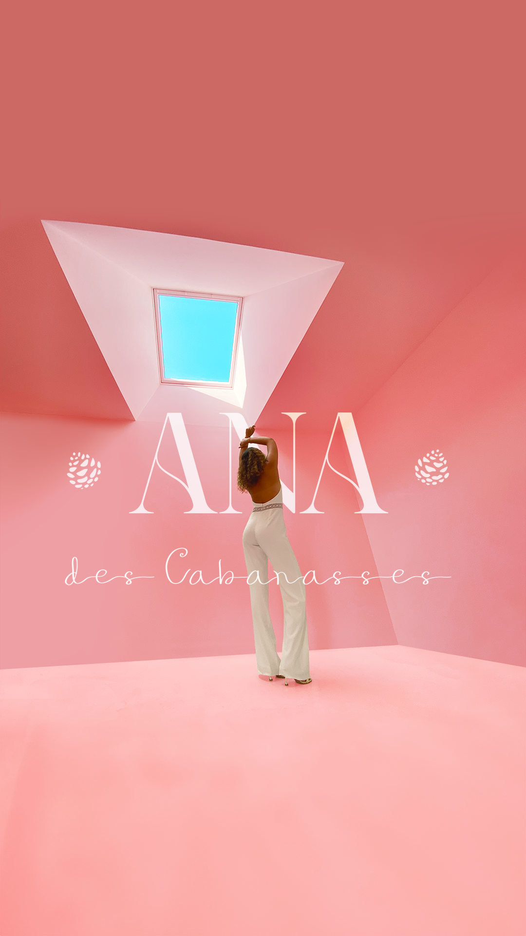
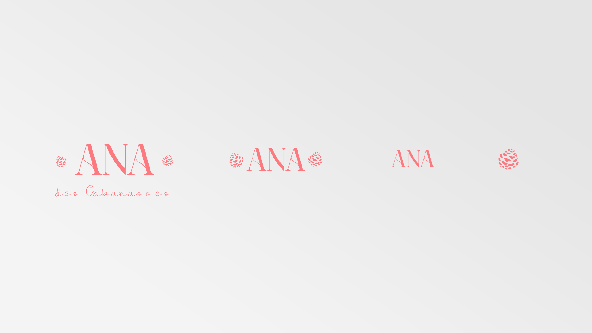
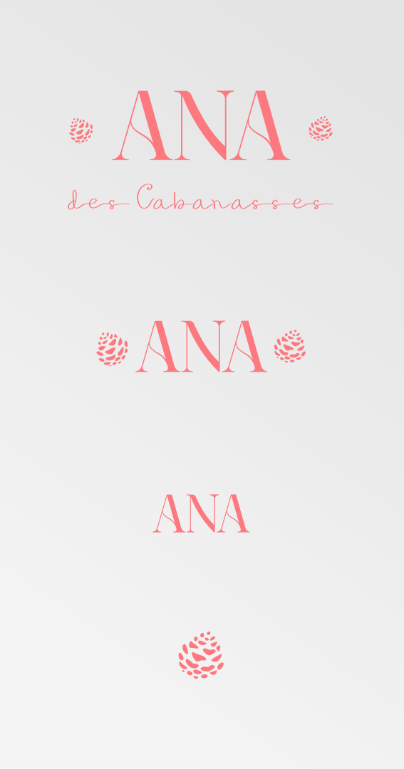
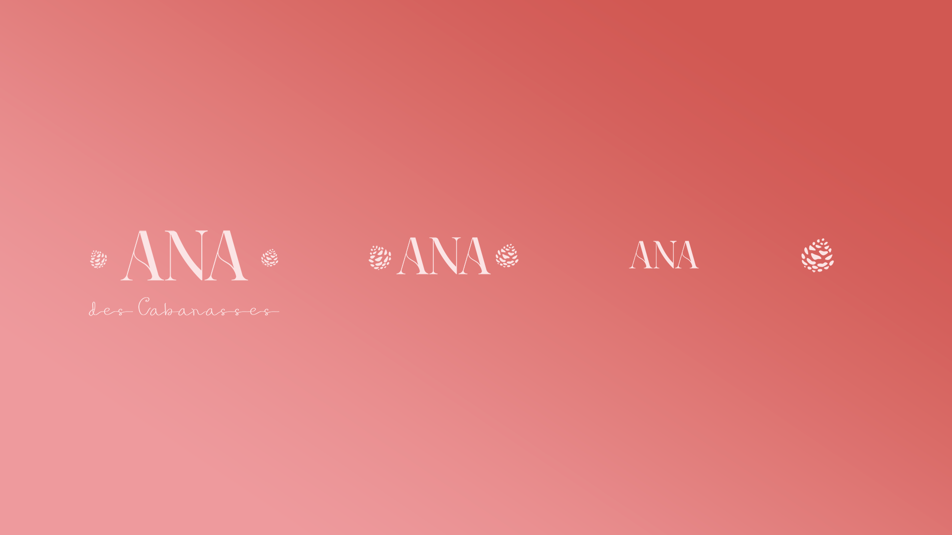
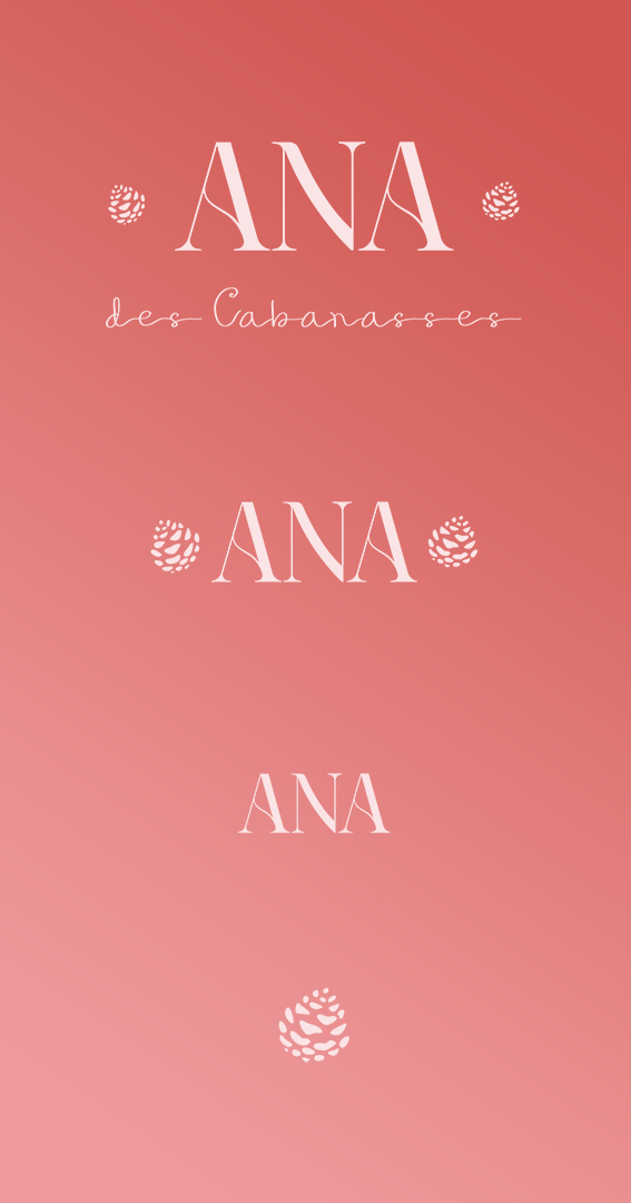
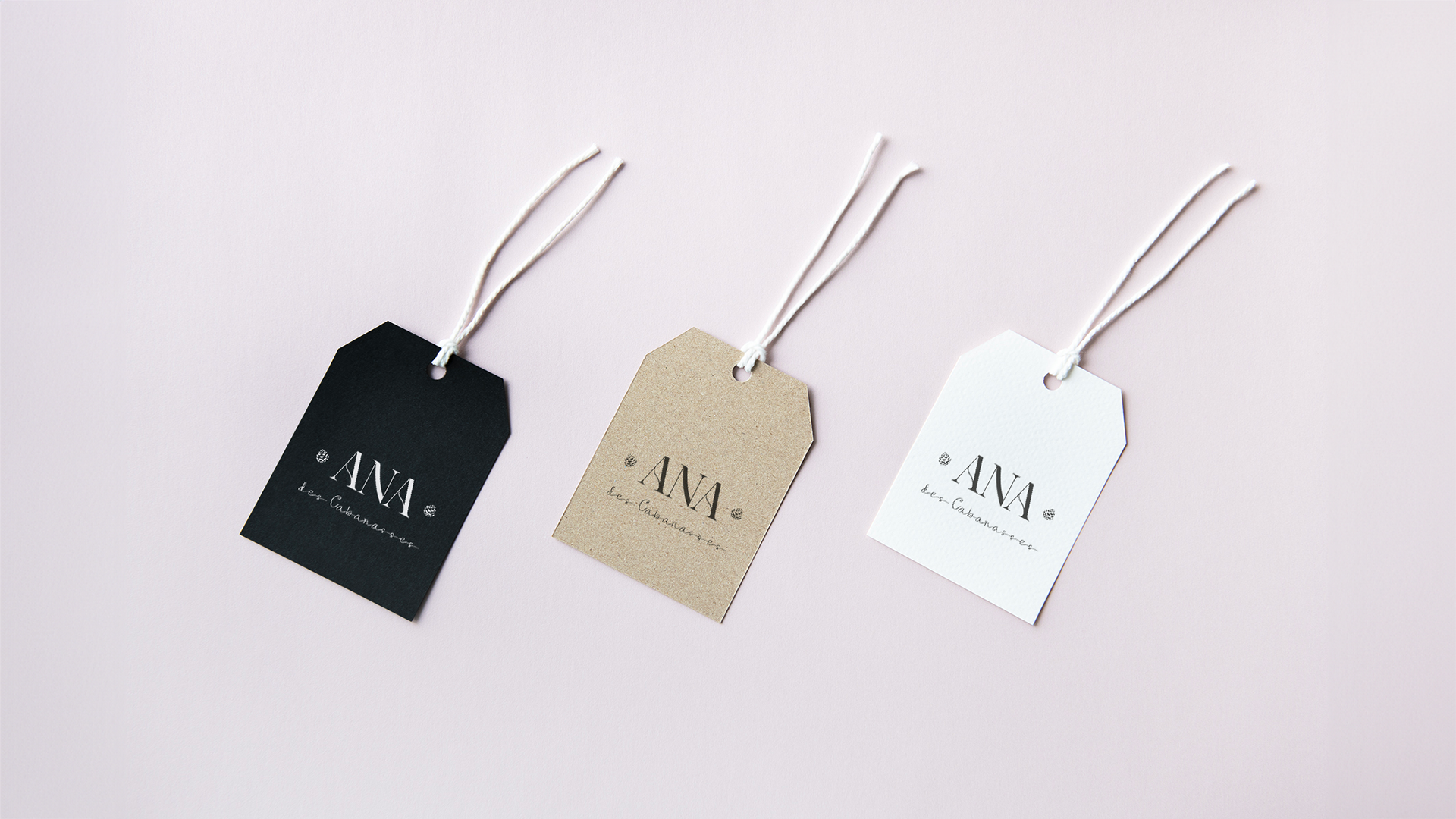
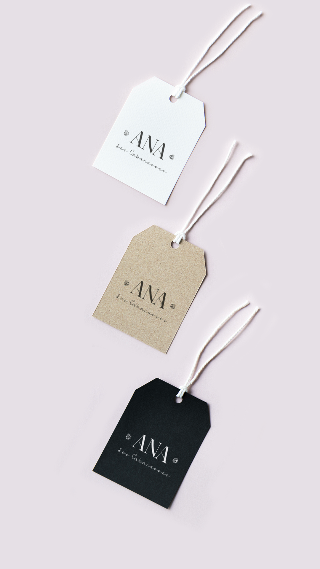
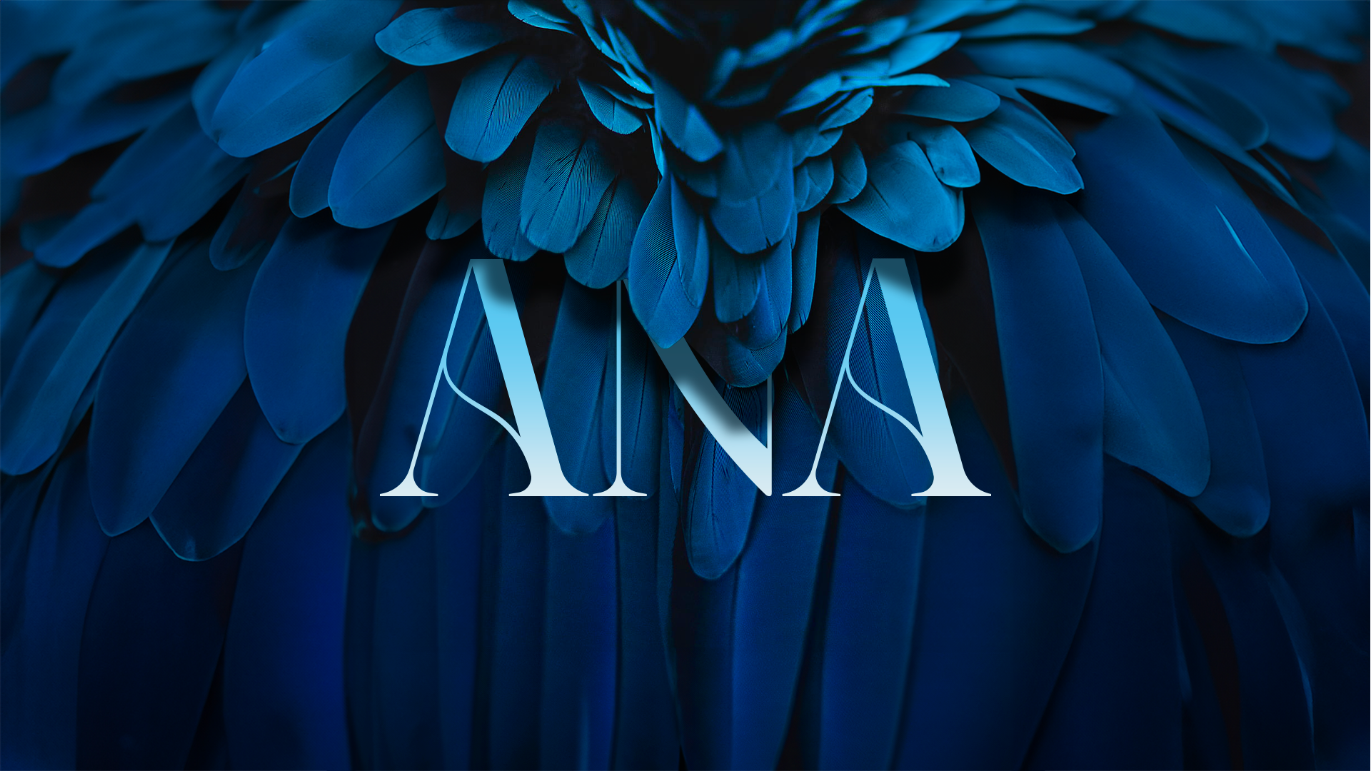
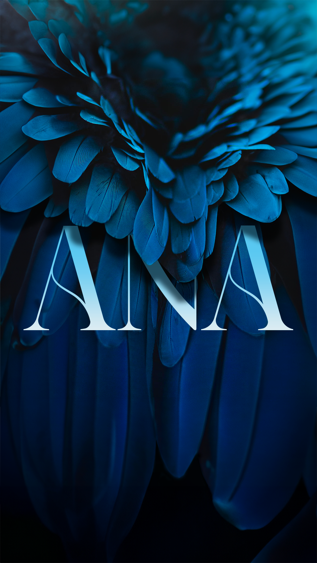
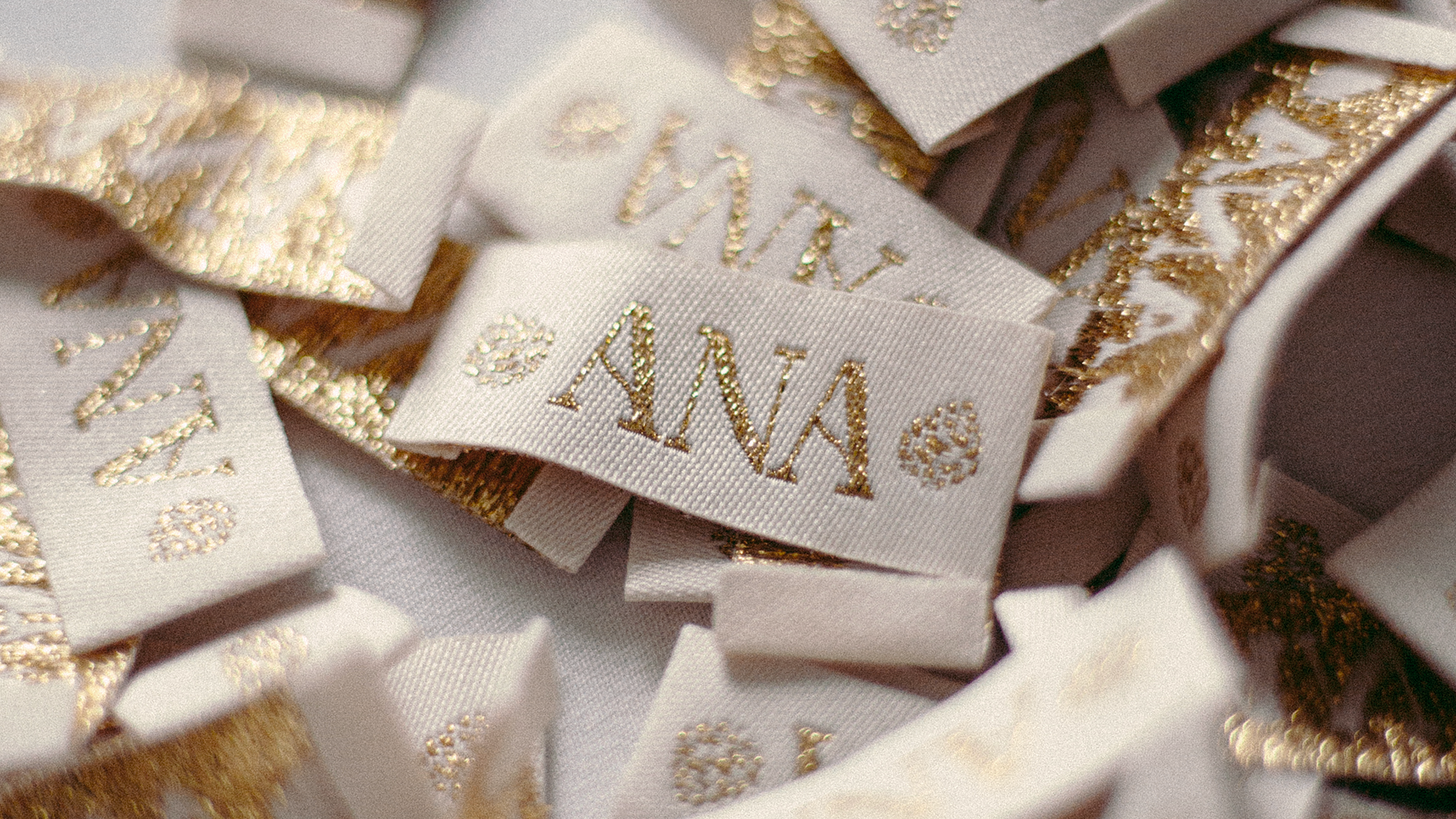
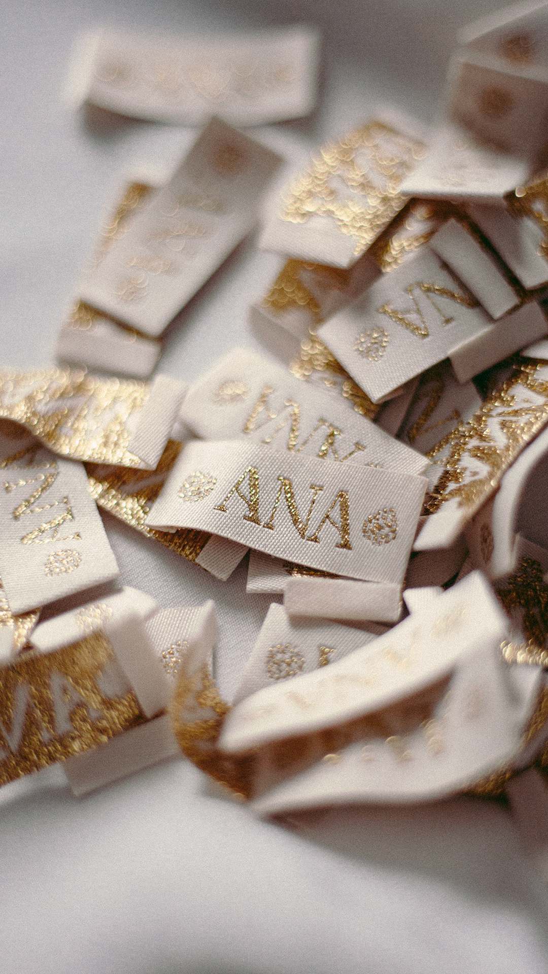
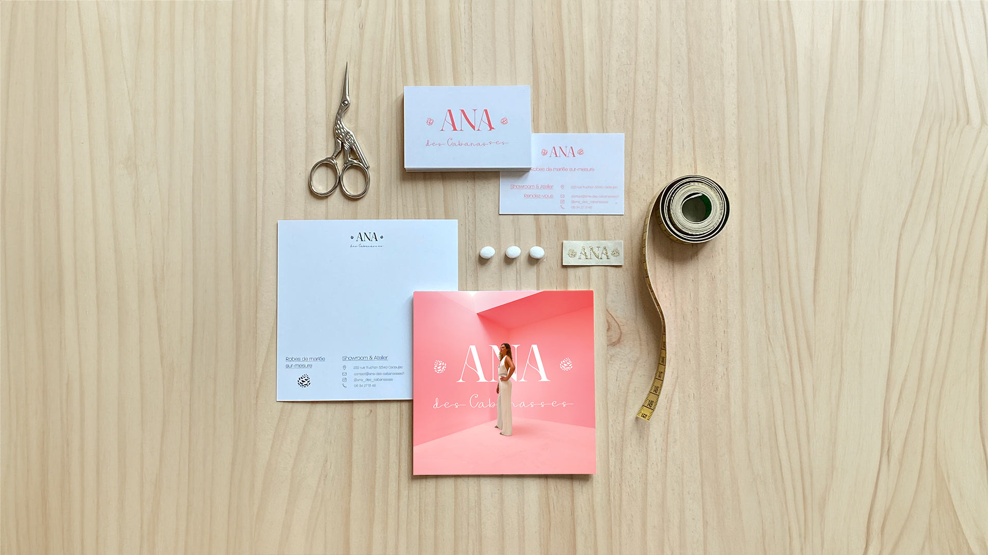
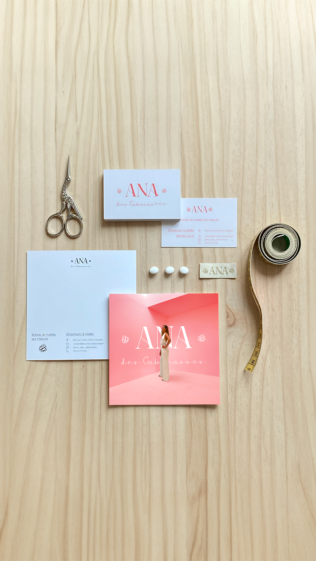
Our collaboration with Ana des Cabanasses, a young wedding dress brand, resulted in a bespoke branding and logo design that lovely fit the spirit of the creator. Elegance and sweetness of living in the southwest of france. The first element, "Ana," is delicately designed in an art-deco style, radiating French sophistication and class. This element serves as the cornerstone, embodying the brand's commitment to local production. The second element, "des Cabanasses," is rendered in a graceful handwriting style, emphasizing simplicity and approachability to the brand. Flanking this, are two pine cones, placed here to symbolize the brand's geographical location. This detail is very important for Ana, whose roots are in these lands.
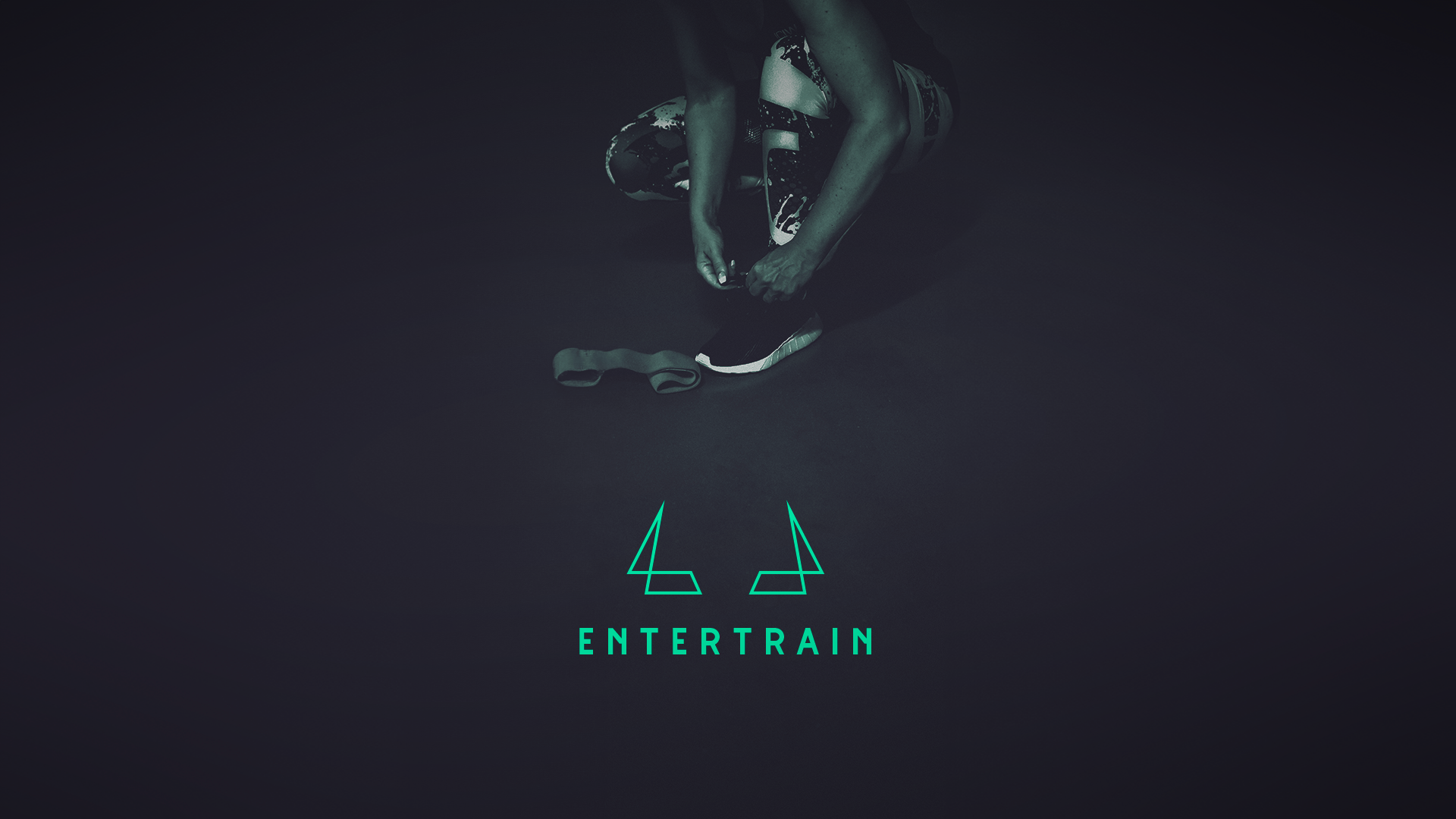
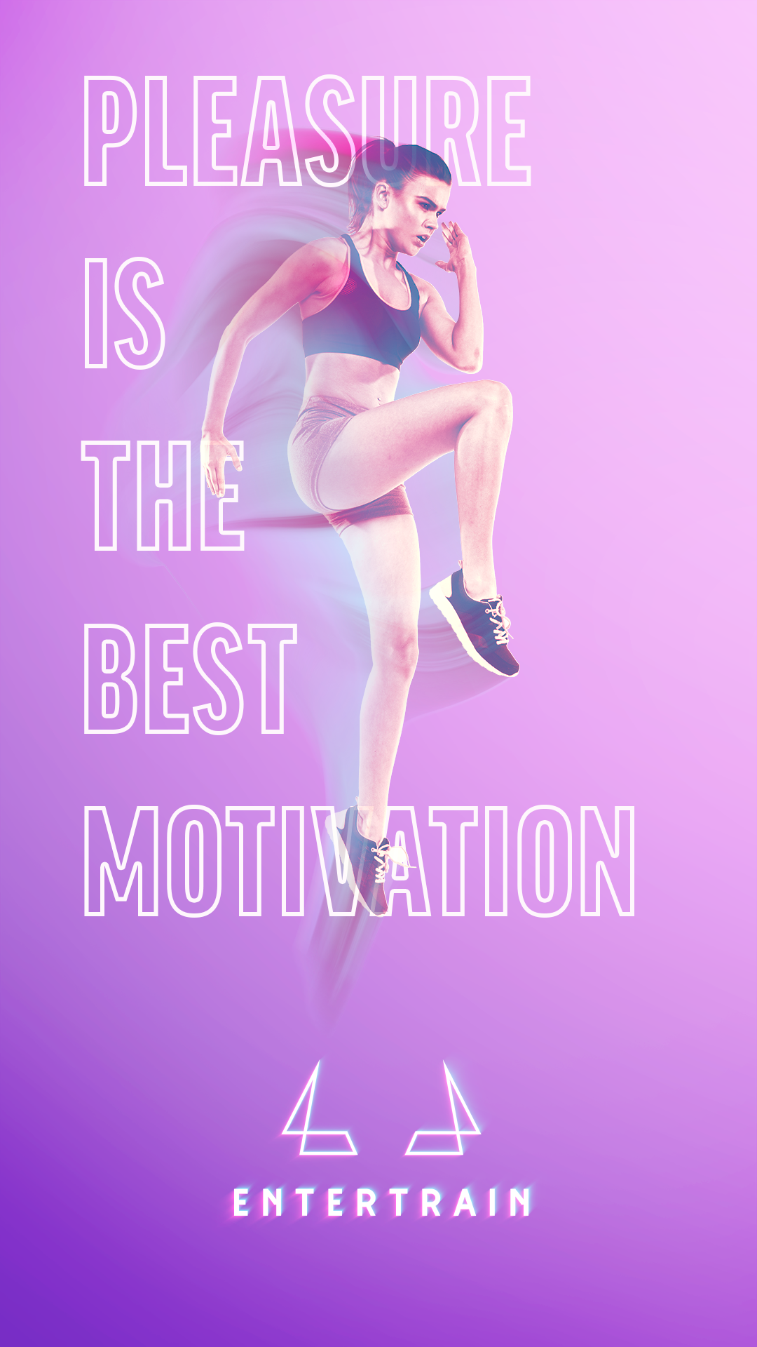
Entertrain
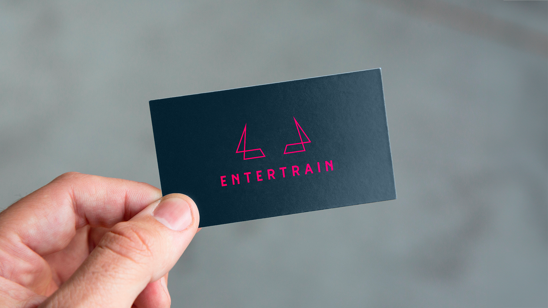
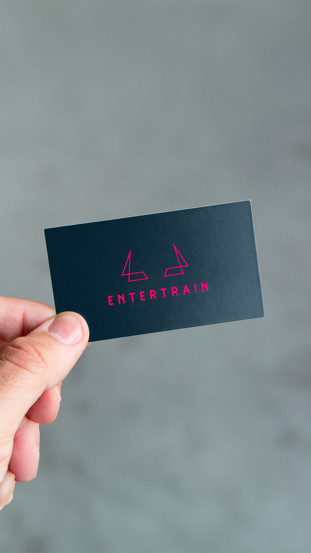
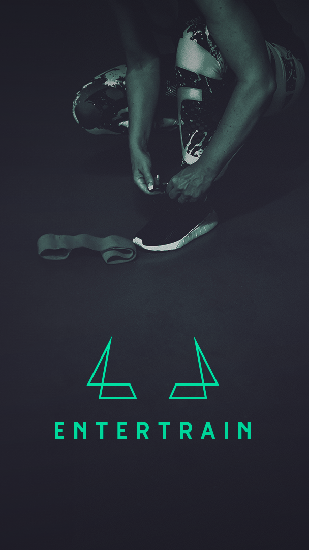
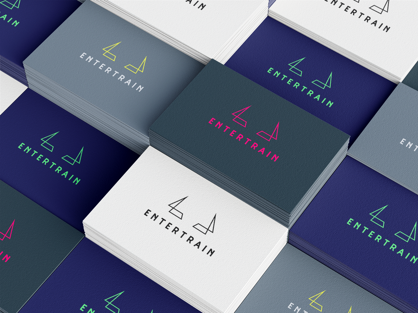
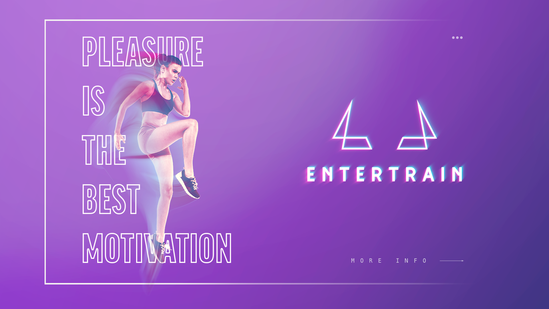
Entertrain’s owner came with the idea that sport must be fun to unveil everybody’s natural strength. That gave us the guidelines for the logo creation. So we worked on a minimalist shape that can represent the joy and enthusiasm that Entertrain brings to every training session and primal strength and determination. The logo is a blend of the playful gesture of contracting biceps a universal action among children, and the horns of a wild bull. The geometric and abstract approach make it more subtile and symbolize the structured and effective training provided by Entertrain. The clean lines and vibrant colors reflect the precision and energy characteristic of Entertrain's coaching style.
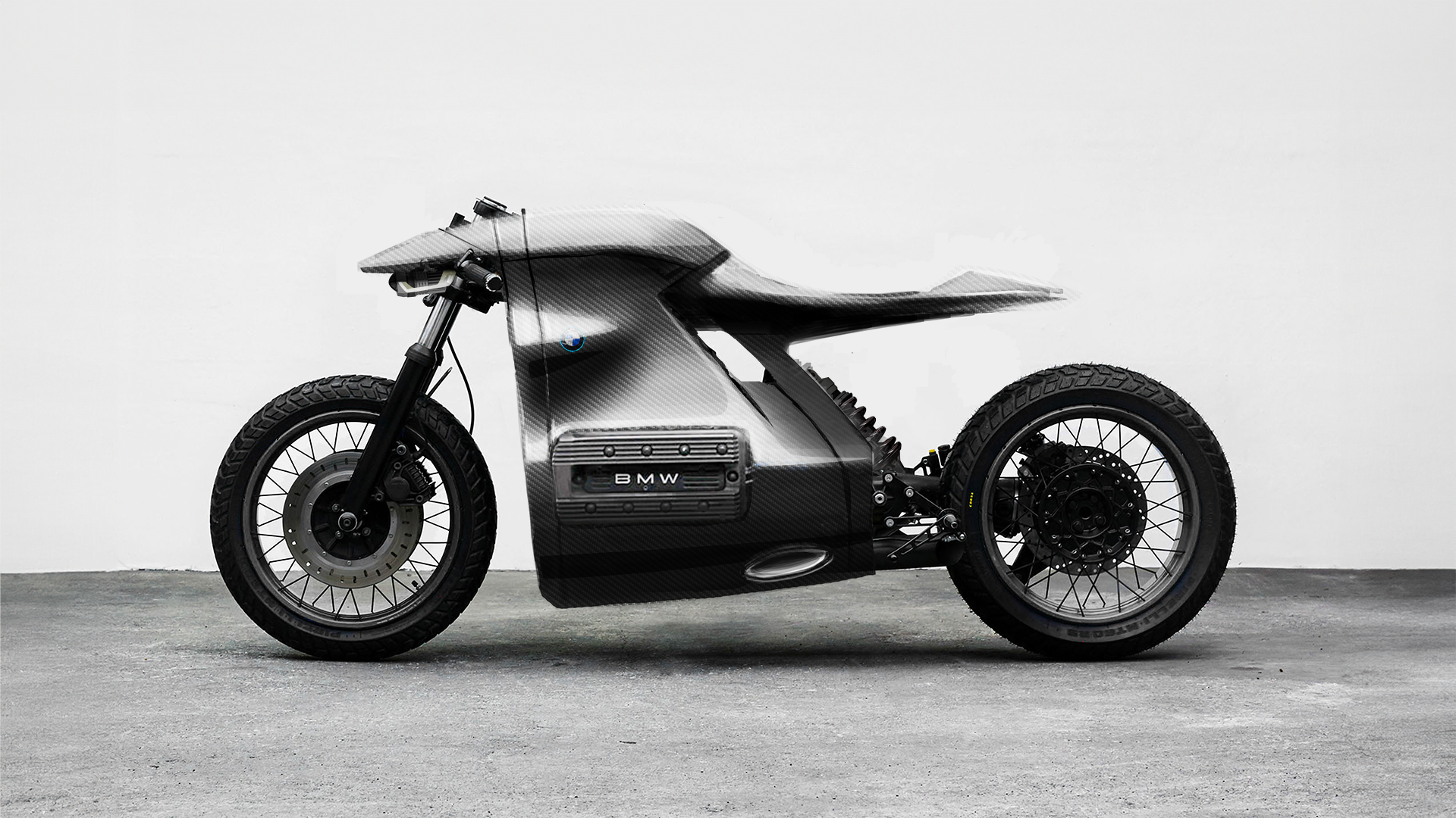
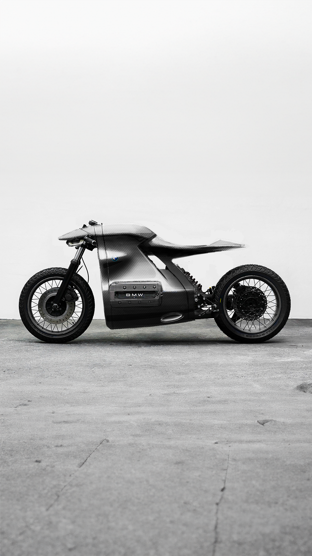
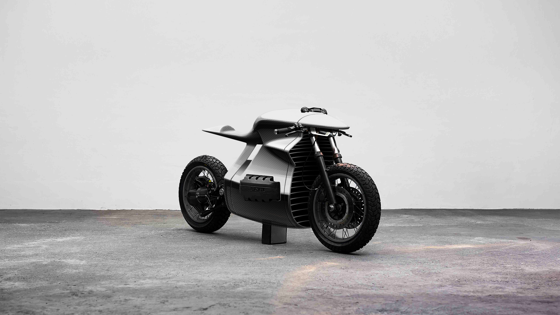
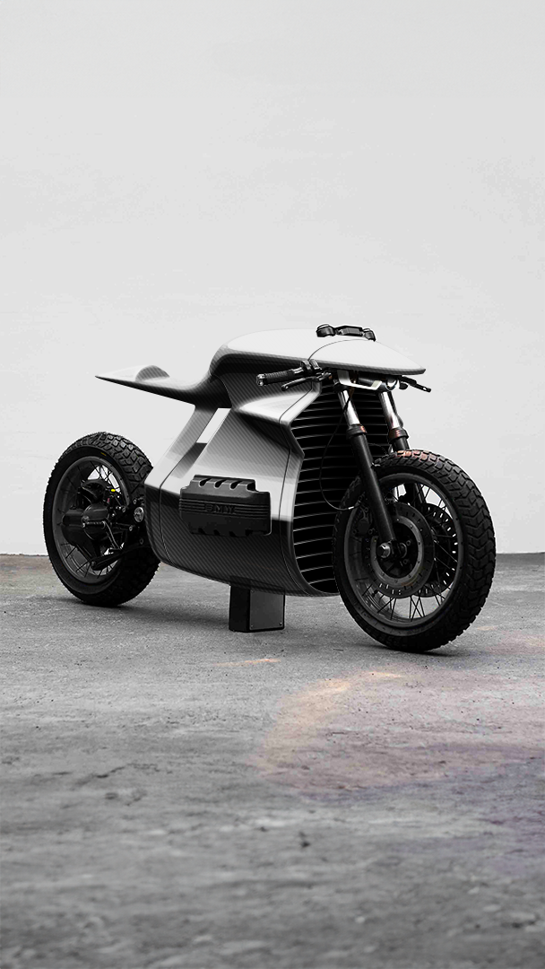
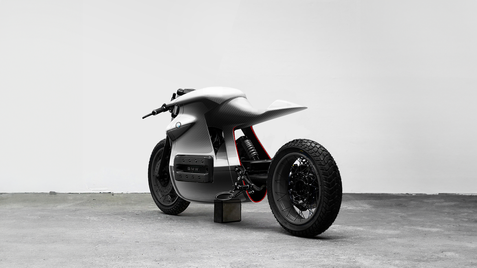
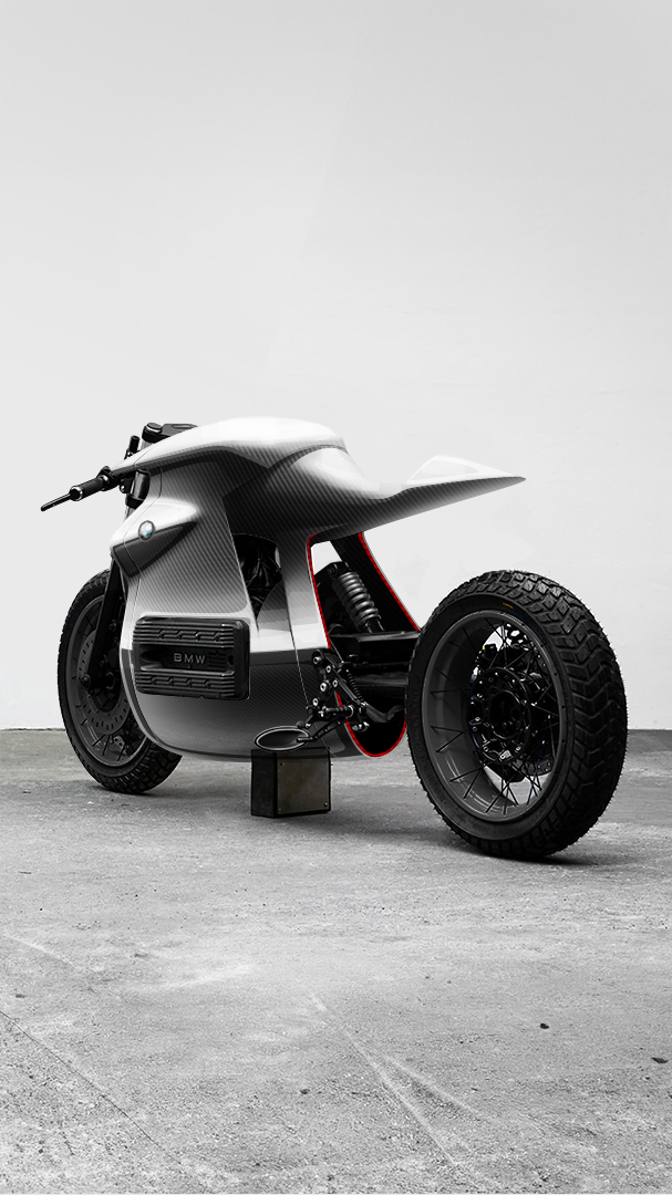
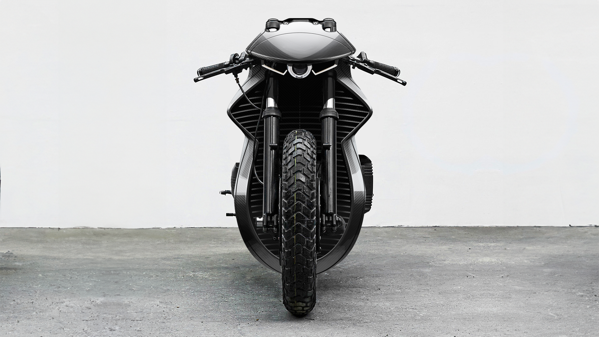
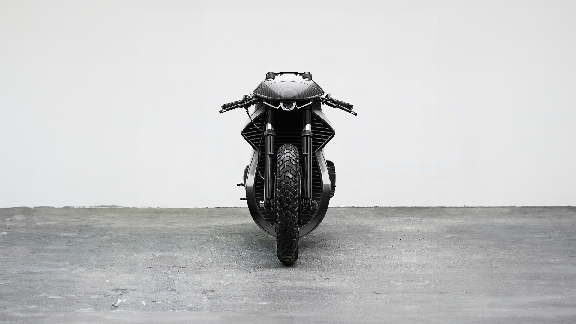
BMW K100
We reimagined the classic BMW K100. Drawing inspiration from the clean lines of modern design and leveraging advanced materials and techniques from the aeronautical industry, this customization is a testament to innovation and craftsmanship. Minimalism takes center stage with a sleek and streamlined silhouette. Unnecessary embellishments are stripped away, leaving only essential elements that contribute to the bike's overall performance and aesthetic purity.
Which expertise
do you need?
Let's have a talk
and grow your business
